Case study
ParKING: Designing a simpler way to find parking
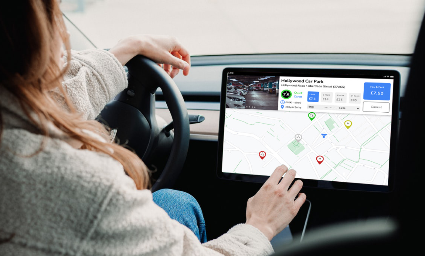
When I worked in Hong Kong, I often drove to visit clients. Finding parking nearby could take time, especially when I did not know if there were spaces or how much it would cost. I designed a web app prototype that showed parking locations, availability and prices on one map.
Role
User research, UX and UI design, prototyping and usability testing
Tools
Figma, Zoom, Microsoft Word, Bandicam
Year
2022
Overview
ParKING was a project I worked on during my UI design course in 2022. I wanted to see if a web app could make it easier for drivers in Hong Kong to decide where to park before they arrived.
Drivers could look for a space at a street meter or use a car park. If they wanted to keep the cost down or park close to their destination, they often had to check a few options before choosing where to go.
The challenge
How could drivers check if a car park or street meter had spaces and see how much it would cost before deciding where to go?
I spoke to drivers in Hong Kong and Birmingham about how they looked for parking. Some told me they had arrived at a car park or a row of meters only to find that all the spaces were taken. Knowing the price helped them plan, but they still needed to know if there was a space.
What I did
1. User interviews
I interviewed drivers in Hong Kong and Birmingham to find out how they looked for parking. I asked how they planned ahead, how long it took to find a space and what problems they ran into.
1. How do you usually find a parking space?
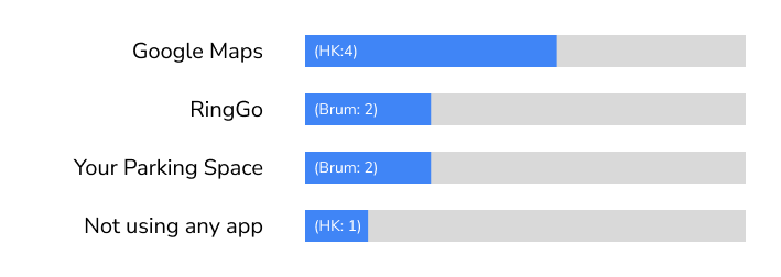
Four of the five Hong Kong drivers I spoke to used Google Maps. The other driver preferred to arrive early and look for a space without using an app. Both Birmingham drivers used RingGo and YourParkingSpace.
2. What type of parking do you prefer?
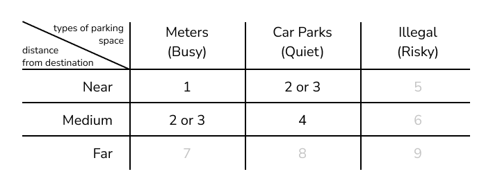
A metered space close to the destination was the top choice. A nearby car park or a metered space a bit further away came next.
3. How long does it usually take you to find a parking space?
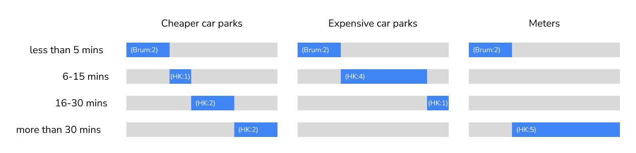
The Hong Kong drivers I spoke to said it usually took them more than 30 minutes to find a metered space. The Birmingham drivers said it took less than five minutes.
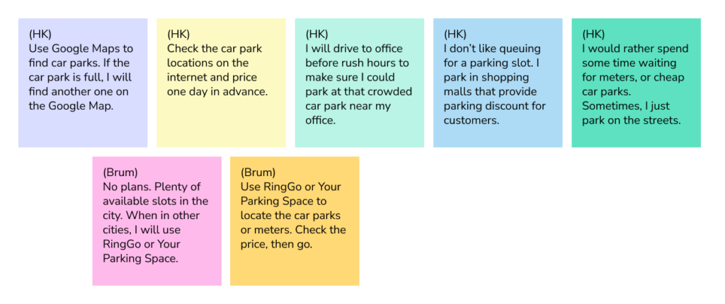
4. What do you do when you need to find a car park?
Some Hong Kong drivers checked prices and looked for backup options before leaving. Some set off early or looked for shopping centre parking discounts. The two Birmingham drivers I spoke to did less planning.
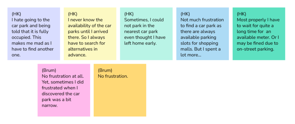
5. What do you find frustrating about looking for parking?
Some drivers said they only found out a car park was full when they got there. One driver said she could usually find a space at a shopping centre, but it cost more.
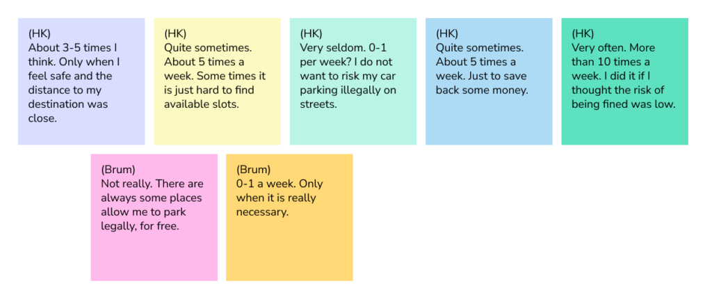
6. How often do you park illegally, and why?
Some drivers said they rarely parked illegally. Others said they did it several times a week. They said they did it to save money, walk less or because they were struggling to find a space.
The interviews helped me decide what to show on the map. I wanted drivers to see where they could park, whether spaces were free and how much it would cost before choosing where to go.
2. Drivers’ perspectives
After reviewing the interviews, I created three personas: Erik, Amy and Adrian. They helped me think about what different drivers needed when looking for parking.
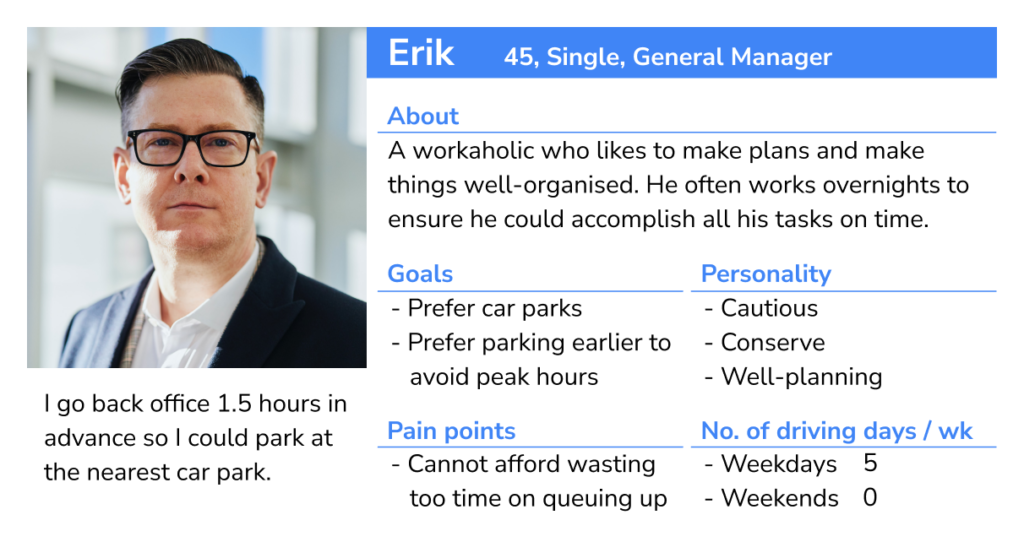
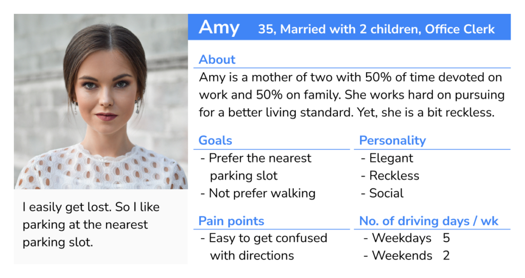
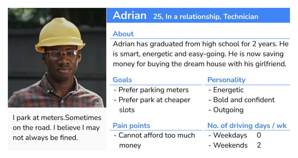
I used the personas to decide what drivers should be able to do in the app. They needed to check if spaces were free, compare prices and find those details in a few steps. I used these goals to plan the first version.
3. Designing the first parking flow
I chose to design a web app that could work on phones, tablets and desktops. I wanted the buttons to be easy to tap and the parking information to be quick to find. In the first version, drivers chose street meters or car parks on the home screen, then opened a map for that type of parking.
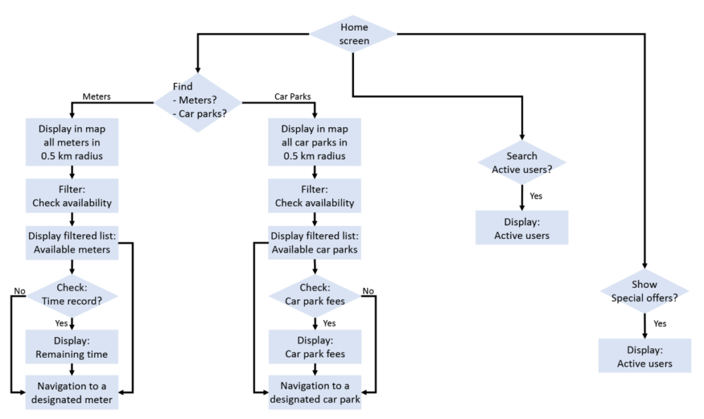
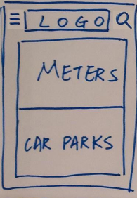
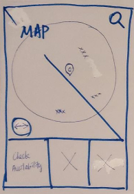
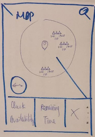
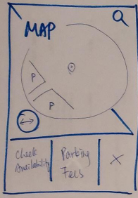
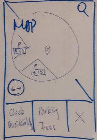
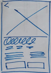
4. Making the map the home screen
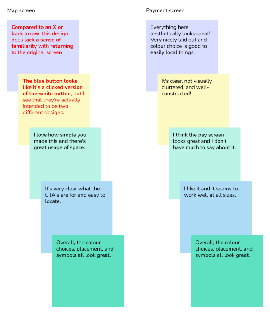
I ran four usability tests on the first design. I grouped the feedback by screen so I could see which parts of the app needed work.
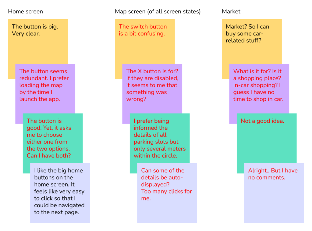
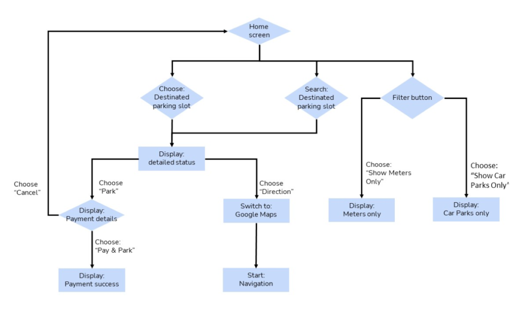
In the second version, I made the map the home screen. It showed both street meters and car parks straight away, and drivers could still filter the map to see just one type. During testing, some people found the marketplace confusing and didn’t see a need for it. I removed it to keep the app focused on finding parking.
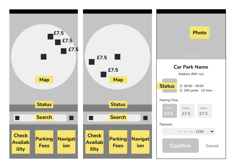
Choosing where to put the main button
I ran a short survey to find out how people held their phones and which of two button layouts they preferred.
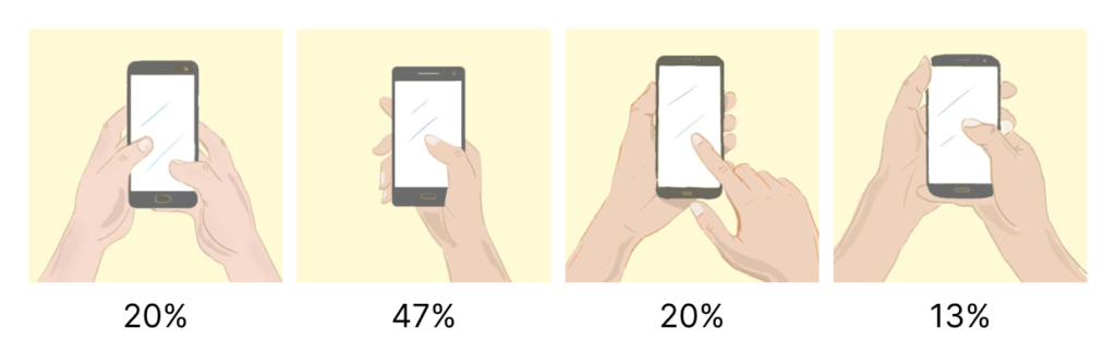
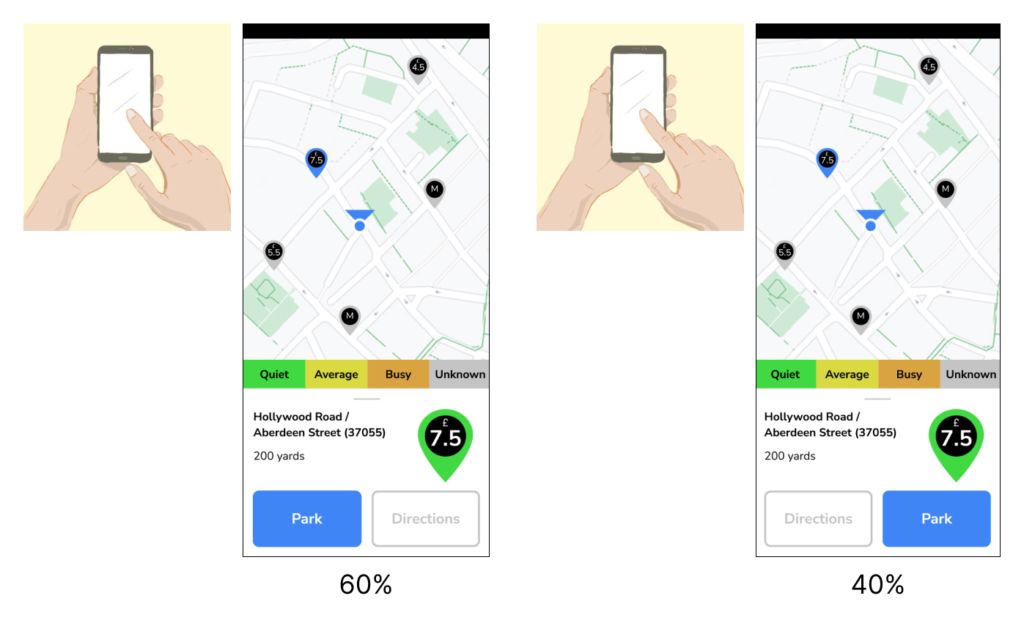
Most people preferred the layout with the main button on the left, so I used it in the third version.
5. Testing the third version
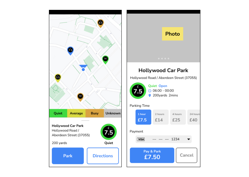
I used the survey results to build the third version in Figma. I kept the main button on the left and added more detail to the map, parking details and payment screens.
Making the parking filters clearer
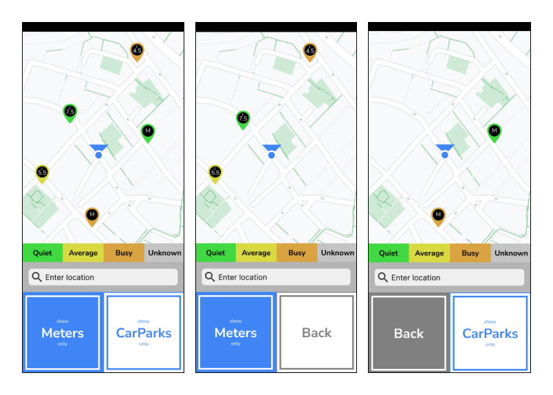
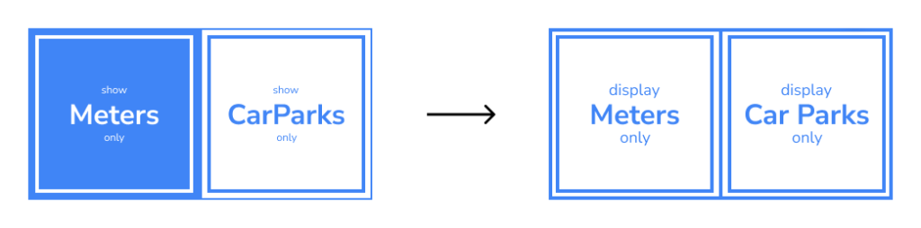
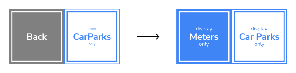
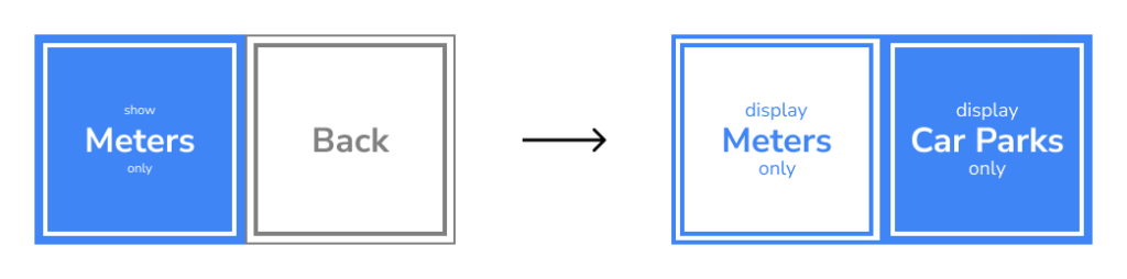
I ran five quick usability tests on the third version. Two comments pointed to a problem with the filter buttons. It was hard to tell which view the map was showing. One person said the blue button looked like a white button that had already been pressed.
That comment gave me an idea. I removed the grey Back button and kept the same two filter buttons in each view. A blue button showed which filter was on. When both buttons were white, the map showed both street meters and car parks.
Outcome
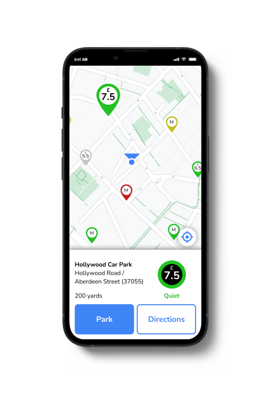
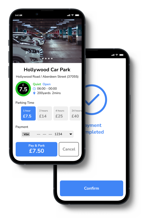
I built a prototype in Figma that people could click through. It opens on a map showing nearby car parks and street meters. Drivers can filter the map, choose a place to park and check the price and availability.
The prototype shows how drivers could get directions or pay for parking from the parking details screen.
Tablet and desktop layouts
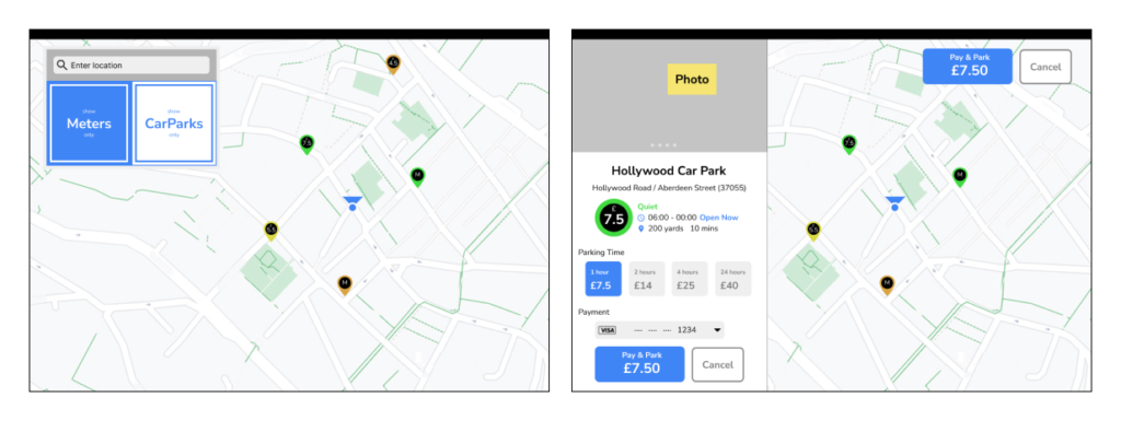
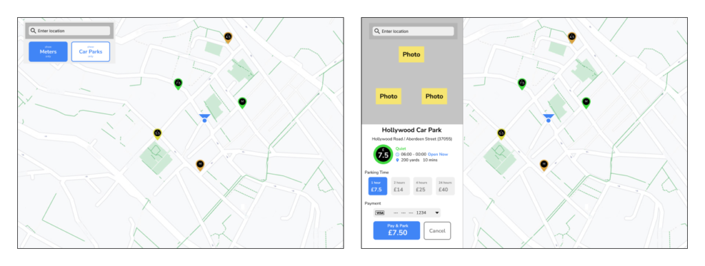
I also designed layouts for tablets and desktops to show how the app could work on larger screens.
What I learned
In the first version, I asked drivers to choose a type of parking before they could see the map. During testing, people wanted to see both street meters and car parks straight away. That helped me see that the map itself was a better starting point.
If I did this project again, I would check earlier where the app could get up-to-date parking prices and availability. I would also test what drivers need to see when the app cannot tell them whether a space is free.