Oxford iSolution
CONTEXT
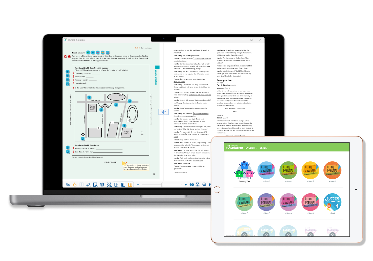
Oxford iSolution is a digital platform for teachers created by Oxford University Press (China) Ltd. It has been introduced in the Hong Kong school market since 2017.
The app combines Oxford coursebook contents and digital teaching materials. So teachers can utilise this all-in-one platform to display ebooks, play videos, assign quizzes, conduct real-time quizzes, etc.
This is the story of how I encountered the field of User Experience.
note:
This case study is a reinterpretation of my experience working on Oxford iSolution (PC version). Some records are omitted.
MY ROLE
As an Account Manager, I worked like a UX Researcher and a Sales Representative.
My regular daily site visits to clients (teachers) from October 2015 to August 2021 enabled me to identify client needs, evaluate feedback, contribute to the UX/UI design of new features and functionalities of the company e-learning app, “Oxford iSolution”, by conducting usability tests and participating in focus groups.
THE GOAL
Oxford iSolution was not sold as a standalone product. Instead, it was one of the “teaching resources” to support the company’s main products: printed school coursebooks.
As a result, our team’s goal was set to be:
Identifying what Oxford iSolution should improve to a level that was competitive enough to help boosting the sales of course book, rather than achieving perfect user experience.
Therefore, the optimisation process was not as quick as it could have been.
I understand this was due to the business nature of the app. But at the same time, I felt a bit sorry to the teachers that some constructive feedback was therefore disregarded.
USER RESEARCH
The aim of the user research was to explore what Oxford iSolution should be improved. It was important to know the user satisfaction and to identify the users pain points throughout the entire app journey.
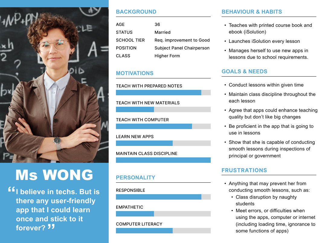
Base on the research finding, the majority of teachers (80%) exhibited characteristics similar to those of Ms. Wong:
USER JOURNEY
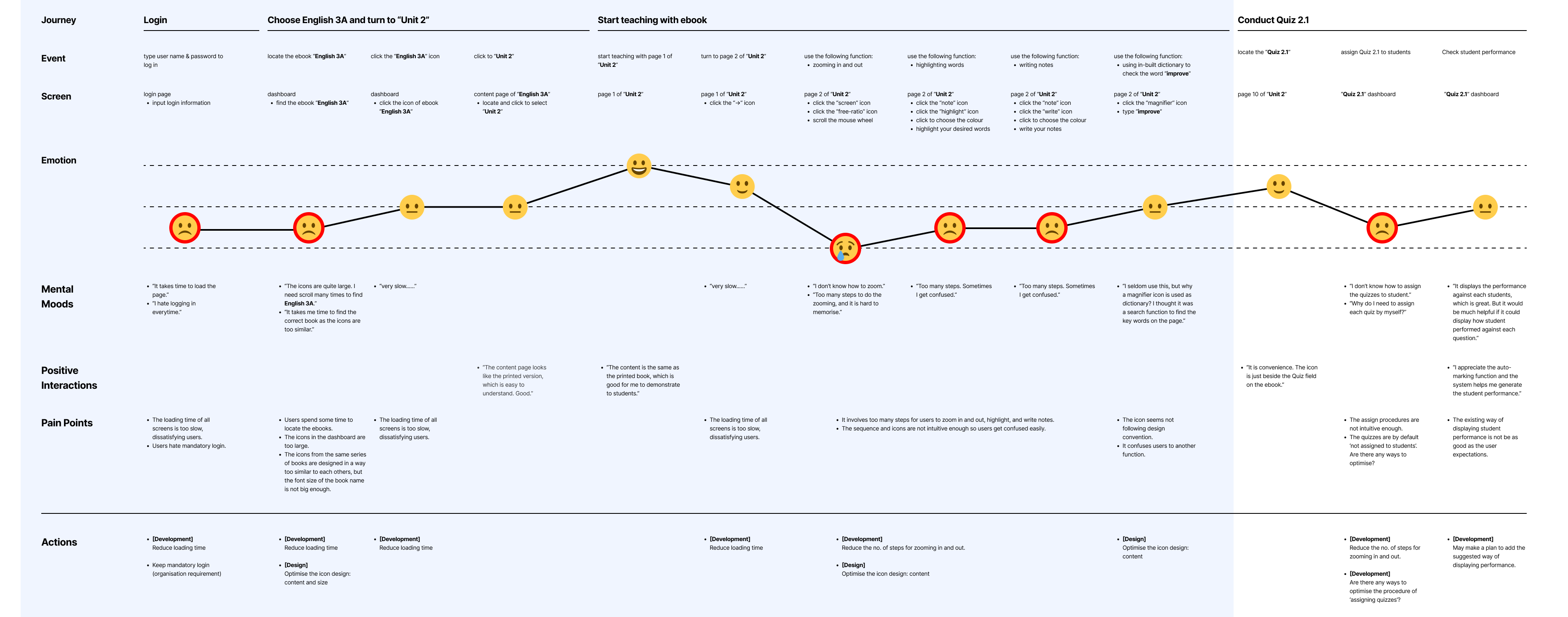
With Ms Wong’s case, I then built a journey map to show how she conducts her lessons daily. This allowed me to identify the pain points and opportunities to improve her user experience.
The initial three sections in blue represent the users’ journey from logging in to displaying the ebook, while the final section involves conducting quizzes. During that time, my primary job responsibilities on iSolution revolved around the blue sections as most teachers used iSolution for displaying their ebook contents.
In the next section, I will describe the challenges I faced while working at Oxford.
PROBLEMS & SOLUTIONS
With reference from the user journey map, teachers generally were not satisfied with the following issues:

Mandatory Login
The app required teachers to log in every time to prevent file leakage of downloadable teaching files.
▼ View

Long Loading Time
The loading time for the content was often slow, which frustrated teachers as every minute counts. The longer the loading time, the greater the change naughty students disrupt the class.
▼ View
Poorly Designed Toolbar
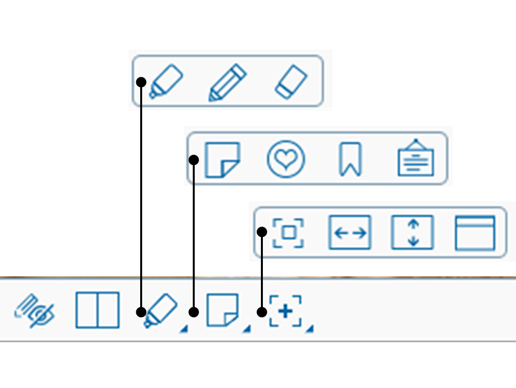
The icons with ambiguous meaning and unintuitive step quite often confused teachers. Some teachers were unable to zoom in and out, scroll horizontally.
▼ View
DETAILS
“I hate logging in.”

“I hate logging in every time.”
Problem
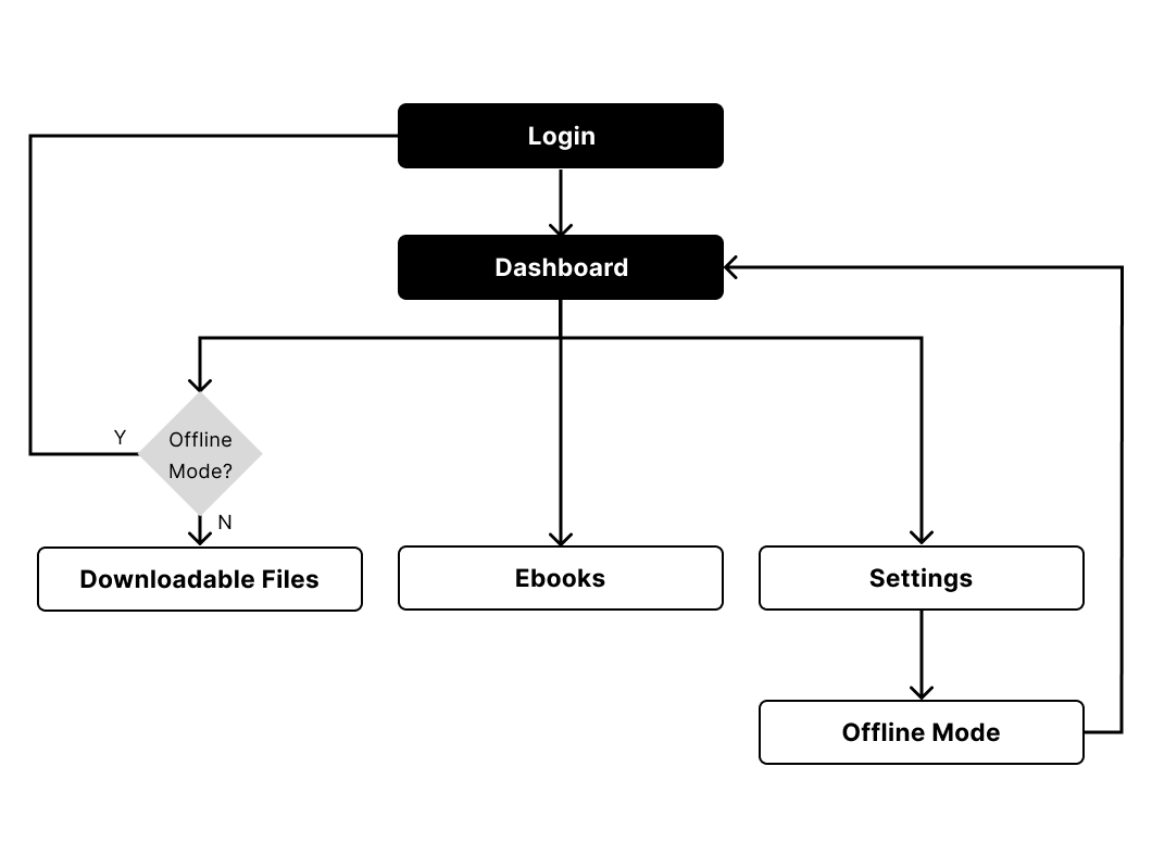
The company required teachers to log in every time due to security concerns, to prevent unauthorised access to downloadable teaching files from any parties except teachers. However, teachers preferred a “saved login” function. In most cases, displaying the ebook were the most frequently used function without downloading other files.
INSIGHTS
- Ebooks were not regarded as downloadable teaching files (“files”)
- Login was mandatory to prevent leakage of “files”
Could the app allow teachers to access ebooks, and deny their access to “files”, without logging in?
Solution
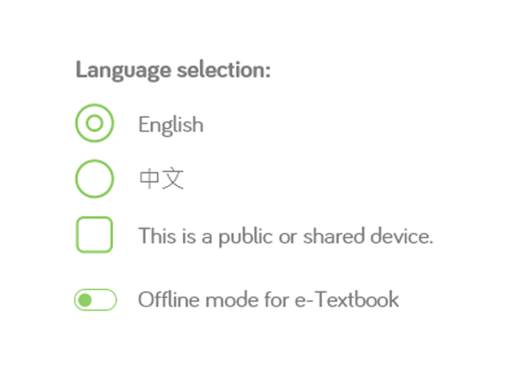
The app introduced an “Offline Mode” option that allowed teachers to keep their account logged in to the classroom PCs and access ebook contents without logging in. Other files were denied access.
Follow up
Although the update was intended to be a welcome one, some teachers were unaware of it, some found the name confusing, and some had already become accustomed to logging in every time. The experience taught that new features take time for users to get used to and gain confidence with. Additionally, more usability tests should have been conducted before the update to reduce user frictions.
▲ Back
“The app is slow.”

“The app is slow. It keeps loading all the time.”
Problem
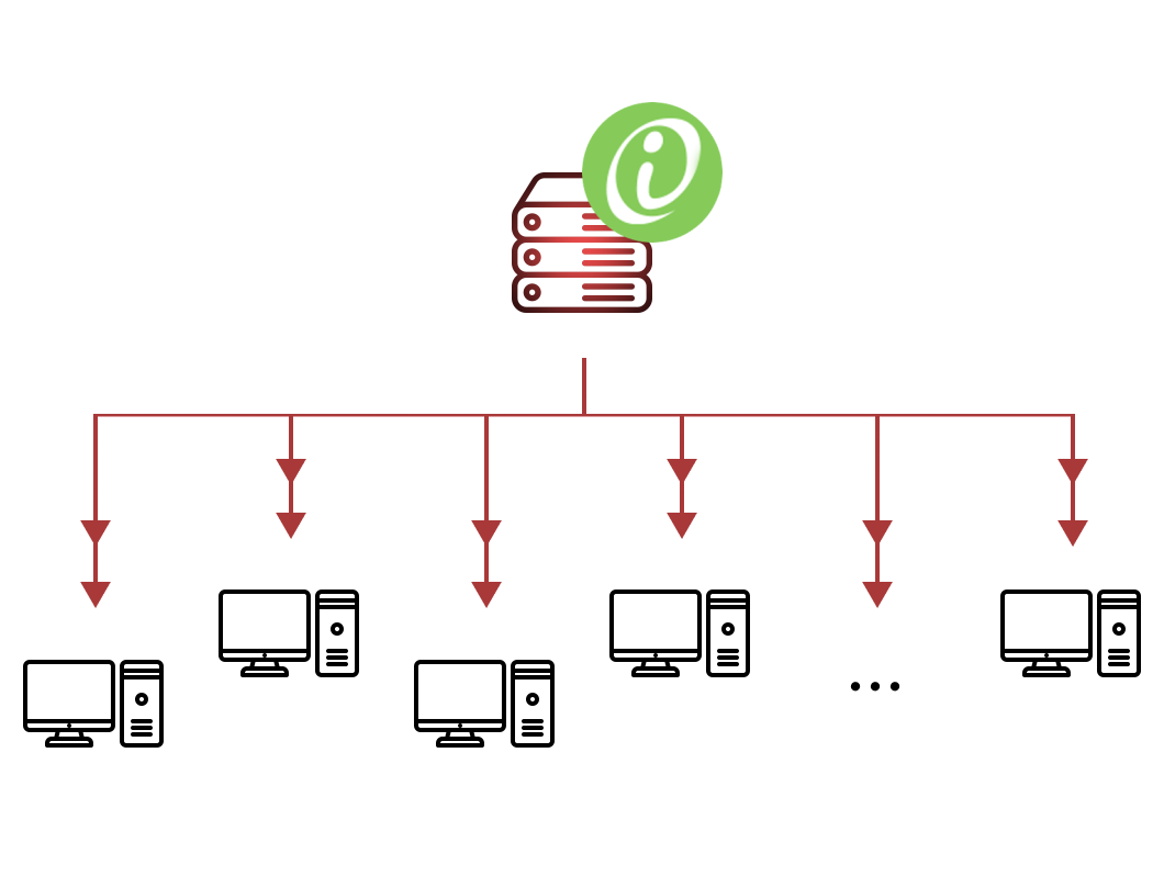
Many teachers installed the app on the school server, which made the app’s performance heavily dependent on the server connection speed. Furthermore, as more teachers accessed the server, the issue became more severe.
Solution
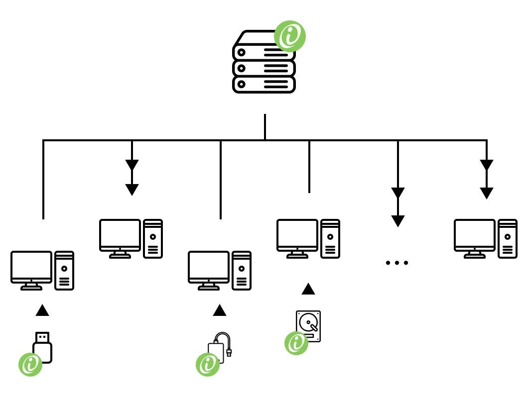
In the short term, we suggested that teachers copy the app to the PCs in the classrooms or portable hard disks, so that the app could be launched via local connections.
Follow up
However, due to the huge file size, saving all teaching resources on every PC was hardly possible, while streaming on cloud when use required reliable connections. In the long term, we suggested that the development team should work on reducing the app’s size to address this issue.
▲ Back
“I DON’T KNOW HOW TO USE THE TOOLS.”

“Too many steps to zoom, scroll horizontally,
highlight, and it is hard to memorise.”
The confusing ebook toolbar design caused a lot of confusion for teachers. They struggled with zooming in and out, scrolling horizontally, and switching between the “scrolling mode” and “highlighting mode” due to the placement of the toolbar, ambiguous icons, and unintuitive steps.
BENCHMARK
1. The icons should be intuitive at first sight.
2. The toolbar’s responded should be predictable.
3. The number of clicks and that of steps should be minimised as much as possible.
4. A clear indicator that shows the screen’s state is necessary.
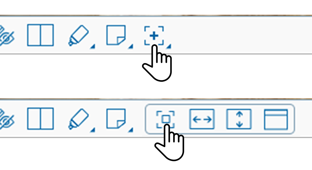
ZOOMING IN OR OUT
Problem
Teachers had to click two ambiguous icons in succession to zoom in or out. This was difficult to understand and led to confusion.

Solution
We suggested replacing the icons with a slider, which had several benefits. This change prevented changing “modes,” reduced the number of clicks needed, and was more intuitive and easier to adjust than using the mouse wheel.
HORIZONTAL SCROLLING
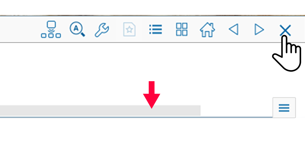
Problem
Some teachers found it difficult to scroll horizontally because the scrolling bar was covered by the toolbar, and an ambiguous icon was required to uncover it.
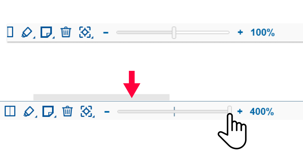
Solution
We recommended moving the scrolling bar above the toolbar, eliminating the need for extra clicks.
HIGHLIGHTING
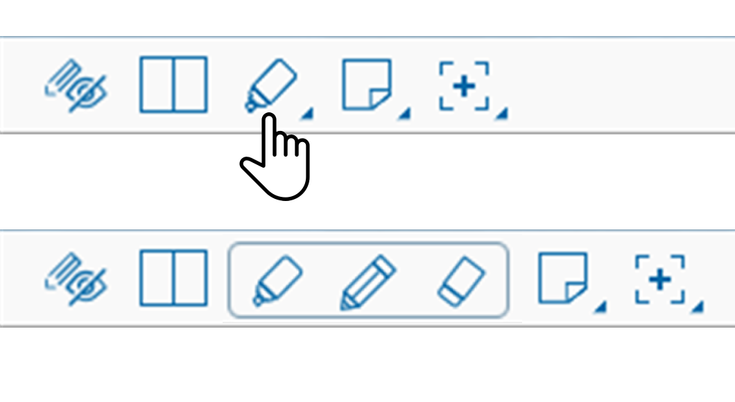
Problem
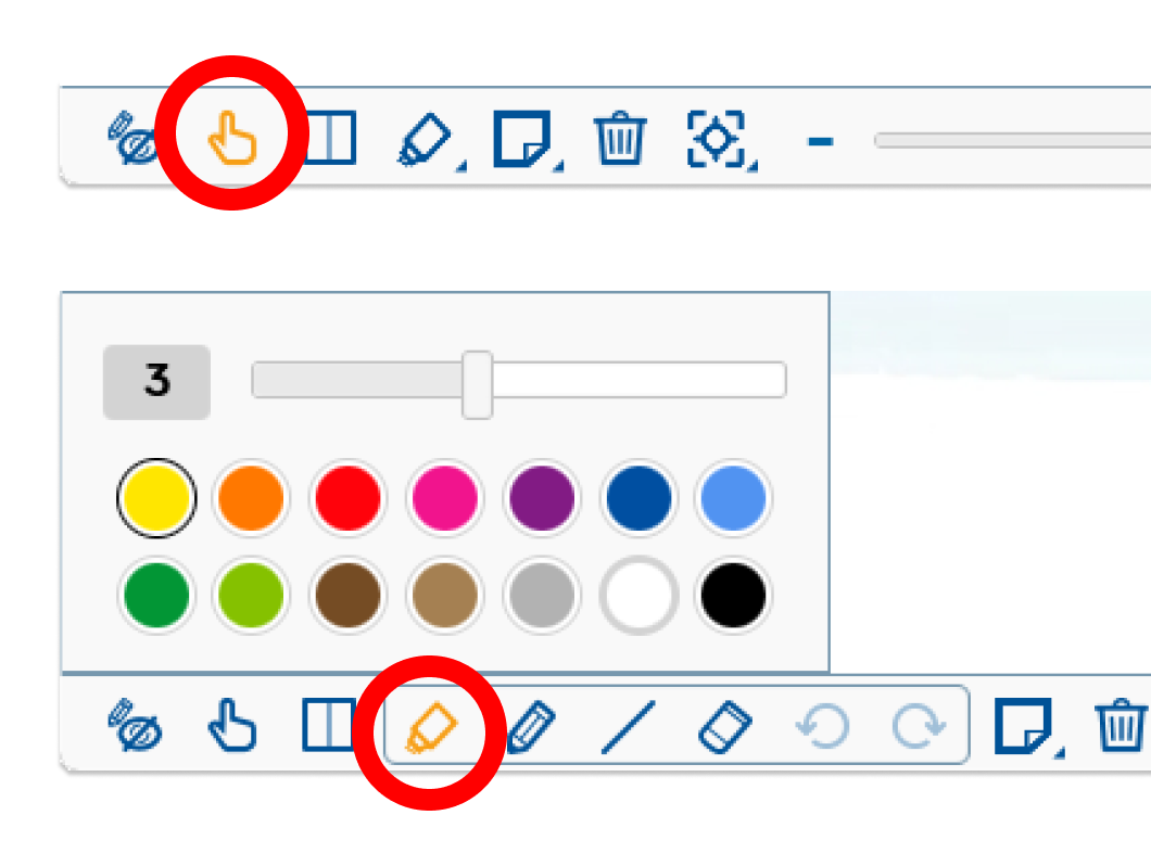
Teachers were having trouble distinguishing between the two screen states, “scrolling mode” and “highlighting mode,” leading to accidental actions such as drawing a line while trying to scroll.
Solution
To address this, we suggested making the current screen state more visible to the user, such as bolding the corresponding icon when the screen is in a certain mode (e.g. “highlighting mode”).
Follow up
Unfortunately, I was unable to conduct any follow-up work on the updates as they were implemented after my departure from the company.
▲ Back
REFLECTIONS
This is the story of how I discovered the field of User Experience. I was unaware that my daily work of exploring client needs was actually a part of UX until I took UX courses and learned about conducting user research.
As an Account Manager, I often found myself in a difficult position. While I was trained to persuade clients to accept the imperfections in the product, it didn’t sit well with me. I couldn’t help but feel sorry for my clients and wished I could offer them a better solution.
This feeling was compounded by my growing interest in UX design. I became increasingly passionate about creating products that truly meet the needs of users and provide them with the satisfaction they deserve. And so, I made the decision to pursue a career in UX, driven by the desire to design products that truly make a difference in people’s lives.

